How I built a Theme Switcher based on Singapore attractions
The Idea
Supporting dark mode is part of the roadmap for my website. After some research, I found Max Böck's implementation of a color them switcher. The execution and the beautiful design widget to toggle themes really blew my mind. Mario Kart 64 race tracks really make a good choice for themes.
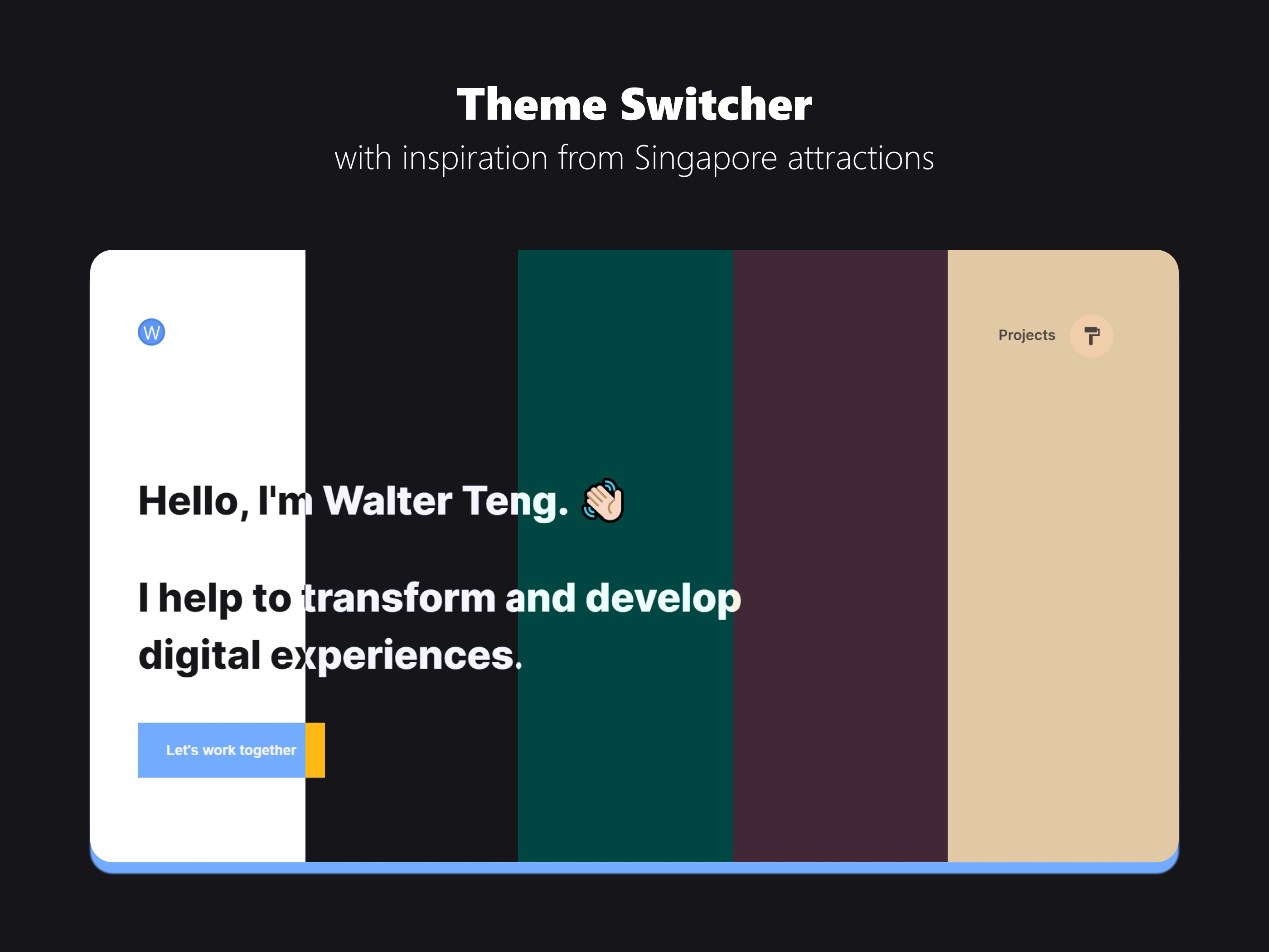
Click on the paint-roller button above to try it!
If you are reading this from somewhere else, this is what it will do:

As Max's website uses Eleventy while mine is built with Gatsby, the guide below will vary in implementation.
Design Exploration
Like how his themes are based on Mario Kart race tracks, I needed a central topic across my themes. After a travel-less year because of COVID-19, many of us have probably explored most tourist spots in our current location. In my home country, Singapore, adult citizens were given SingapoRediscover Vouchers to support local tourism businesses. I have enjoyed my time at some of these places, thanks to this initiative. 💡 tadaa~, I have an idea now!
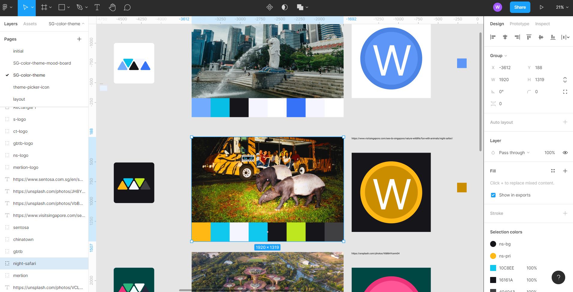
After going through the list of Singapore attractions, I shortlisted 5 with distinct color hues and extracted 8 colors to form individual color swatches using Figma.
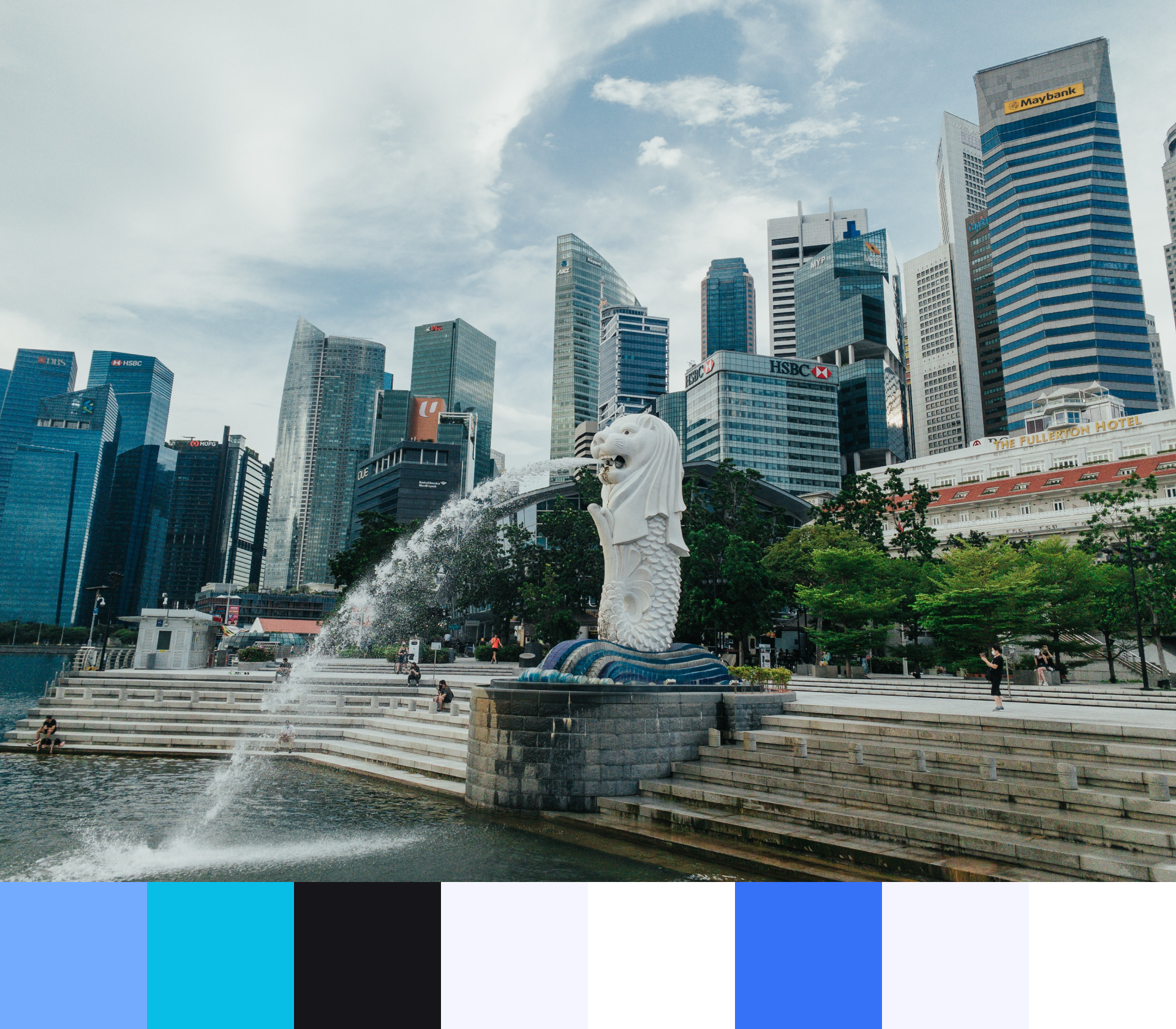
Merlion
I picked Merlion for the default light theme,
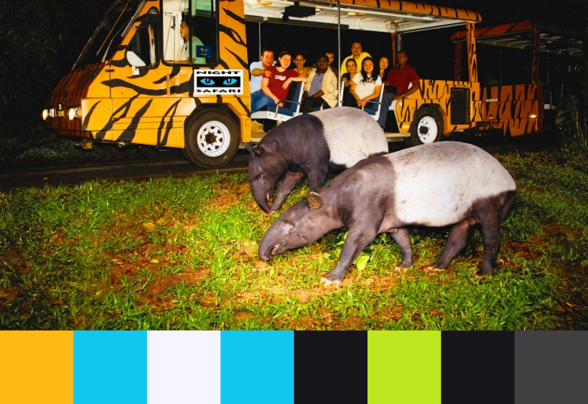
Night Safari
Night Safari for the default dark theme,
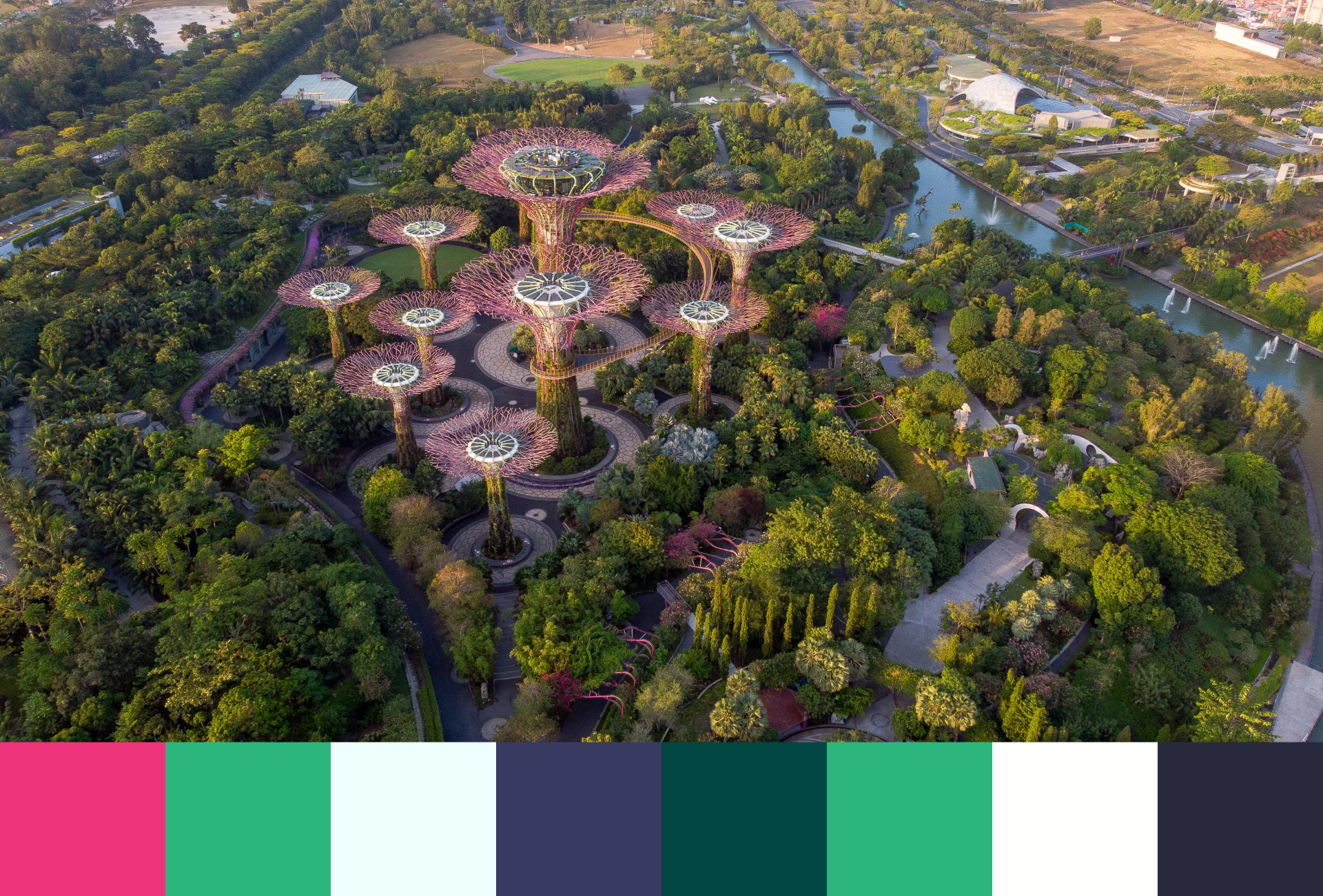
Garden by the Bay
Gardens by the Bay for the natural theme,
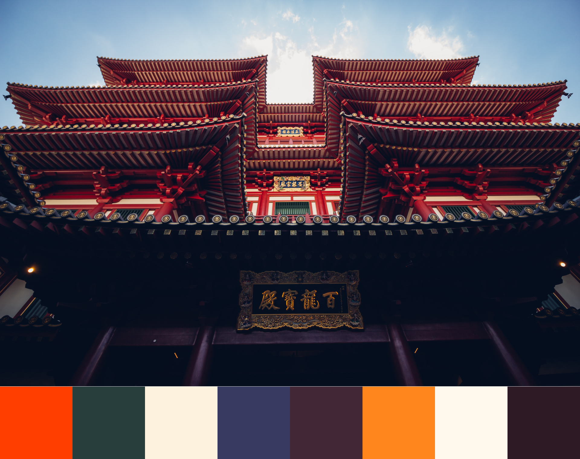
Chinatown
Chinatown for its distinct look (inspired by the Chinatown Maroon in Jonathan Tan's Singapore Pantone project),
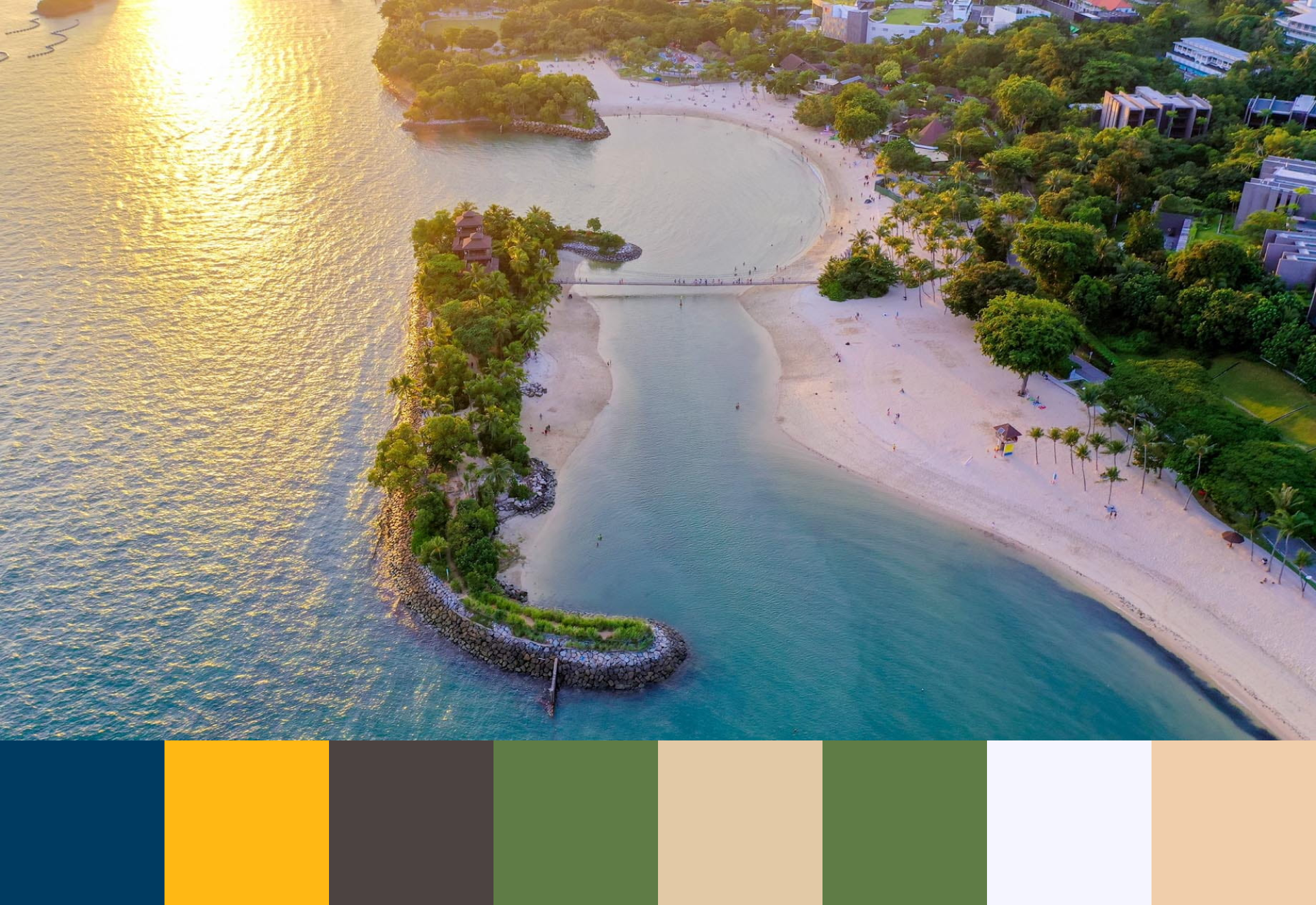
Sentosa
and, lastly, Sentosa for the relaxing beachy vibes.
Color Picking
To keep things simple, I picked 8 colors for each theme, just like Max have done. Having 8 colors is manageable and I find it sufficent for my website's design. You can have any number of colors as you see fit.
  --color-primary: for links
  --color-secondary: for ::selection selector
  --color-text: for normal text
  --color-border: for border
  --color-background: for main background
  --color-primaryOffset: for hover links;
  --color-textOffset: for emphasized text like sub-headings;
  --color-backgroundOffset: for components which requires some background constrast like cards and code blocks;
We can use any online image color picker like this to help us pick the dominant colors from an image. However, after some trial and error, I decided to do it manually using Figma so I can see how the selection of colors would look together on a page.
Depending on how you decide to group the colors on your site, some implicit color rules have to be considered when finalizing the color swatches. For example, text color, primary color and primary offset color have to be distinct from background and background offset color to ensure the site's readability.
Implementation
Setting up gatsby-plugin-theme-switcher
Fortunately, Ruben Casas created the gatsby-plugin-theme-switcher plugin which made the implementation of a theme switcher with Gatsby straightforward.
After installing gatsby-plugin-theme-switcher, we can add the plugin to our gatsby-config.js.
Reuben provided a helpful feature in which we can declare our defaultDarkTheme and defaultLightTheme. The defaultDarkTheme takes advantage of the CSS media feature, prefers-color-scheme. If the user has indicated the dark preference through the system or user agent setting, the user will be greeted with the defaultDarkTheme first.
module.exports = {
  plugins: [
    {
      resolve: "gatsby-plugin-theme-switcher",
      options: {
        defaultDarkTheme: "theme-merlion",
        defaultLightTheme: "theme-night-safari",
      },
    },
  ],
}
Next, we can arrange our color palettes from above into CSS variable with the .theme-* format.
.theme-night-safari {
  --color-primary: #ffb814;
  --color-secondary: #10c8ee;
  --color-text: #f5f5ff;
  --color-border: #10c8ee;
  --color-background: #16161a;
  --color-primaryOffset: #bee71f;
  --color-textOffset: #16161a;
  --color-backgroundOffset: #404043;

  --color-logo-text: #ffffff;
  --color-logo-circle: #ca8d00;
  --color-logo-ring: #ffb814;
}
Subsequently, we have to change every color attribute in our CSS to use the CSS variables that we have declared. Yes, every single one of them!
  body {
    width: 100%;
    margin: 0 auto;
    font-size: 16px;
    line-height: 1.5;
    color: var(--color-text, #16161a);
    background: var(--color-background, #ffffff);
    -webkit-font-smoothing: antialiased;

    @media (max-width: ${dimensions.maxwidthMobile}px) {
      font-size: 14px;
    }
Toggle SVG Colors
Additionally, if we have any SVG icons that we want to toggle alongside with the themes, we can change the fill attribute to take in the CSS variable.
For example, my site icon is a SVG which should change along with the theme ideally.
Instead of generating multiple image assets, we can modify the SVG code to accept a CSS variable.
  <svg
    width="31"
    height="31"
    viewBox="0 0 31 31"
    fill="none"
    xmlns="http://www.w3.org/2000/svg"
  >
    <path
      d="M15.5 31C24.0604 31 31 24.0604 31 15.5C31 6.93959 24.0604 0 15.5 0C6.93959 0 0 6.93959 0 15.5C0 24.0604 6.93959 31 15.5 31Z"
      fill="var(--color-logo-ring, #4B84E5)"
    />
    ...
  </svg>
Building UI Component
Finally, we can build either a theme toggler or a theme picker UI component for the user to change themes. I have built both types of components, and you can find these components in my Github repo. The theme toggler method is also provided as an example in docs by Reuben.
Since I have opted to find a theme picker inspired by Max's UI design, I will further discuss it.
First, we can create a hashmap to represent all the available theme options, each containing the theme name and the SVG icon.
const allThemes = new Map([
  ["Merlion", MIcon],
  ["Night Safari", NSIcon],
  ["Garden by the Bay", GBTBIcon],
  ["Chinatown", CTIcon],
  ["Sentosa Sunset", SSIcon],
])
We will loop through the map and create a ThemeButton component for each item in the map.
const ThemePicker = ({ theme, setTheme }) => {
  return (
    <ThemeButtons>
      <ReactTooltip />

      {[...allThemes].map((item) => {
        let name = item[0]
        let svg = item[1]
        const themeVal = name.toLowerCase().replace(/ /g, "-")

        return (
          <ThemeButton
            key={name}
            className={`theme-${themeVal}`}
            aria-label={`Theme ${name}`}
            className={`${
              theme === `theme-${themeVal}` ? "selectedTheme" : ""
            }`}
            onClick={() => setTheme(`theme-${themeVal}`)}
          >
            <div data-tip={`${name}`}>
              <img src={svg} />
            </div>
            <ThemeName
              className={`${
                theme === `theme-${themeVal}` ? "selectedThemeText" : ""
              }`}
            >
              {name}
            </ThemeName>
          </ThemeButton>
        )
      })}
    </ThemeButtons>
  )
}
To switch themes, we can use the ThemeContext.
import React, { useContext } from "react"
import { ThemeContext } from 'gatsby-plugin-theme-switcher';
...
const { theme, switchTheme } = useContext(ThemeContext)
...
<ThemePicker theme={theme} setTheme={switchTheme} />
The remaining step is to apply CSS for the ThemePicker component and it is dependent on the look on that you are trying to achieve.
I would like your feedback! Other than the Merlion and Night Safari theme, I am unsure how the remaining themes fares in terms of color accessibility. If you find that the color combination is affecting the site’s readability, please reach out so that I can improve on it. 😀
Bonus
Below is a snapshot of my Figma screen behind the scenes while I was picking suitable color combinations and creating the image assets. The color styles feature is a lifesaver!
Tools for Sharing
Below are some useful links that I have gathered while working on this feature:
- Happy Hues: helps you visualize how a color palette would look on a website
- Adobe Color: explore popular color palettes
- Color wheel: A color wheel by Canva to help you select harmonious colors