Gestalt Principles in UI Design
Some references and budding ideas on Gestalt Principles in UI design
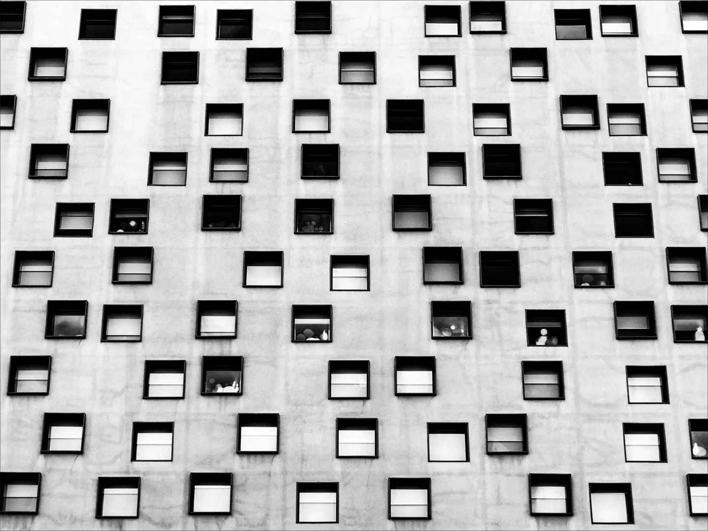
Table of Contents
Gestalt is a German word for form or shape.
Many of the design principles we follow today come from Gestalt Theory. It is a school of thought that started in the early twentieth century in Austria and Germany. The founders (Max Wertheimer, Wolfgang Köhler, Kurt Koffka) argued that we perceive whole patterns first, individual components second. The whole is more than the sum of its parts.
Understanding how your brain works will enable you to become a wiser designer. It can assist you in determining which visual elements are most effective in any given situation, allowing you to use them to influence perception, direct attention, and effect behavioral change. This is notably useful in fields such as User Interface (UI) design.
Proximity, similarity, continuity, closure, figure/ground, and symmetry & order (also known as prägnanz) are the six individual principles commonly associated with gestalt theory. Some newer principles are sometimes associated with gestalt, such as common fate.
Proximitycopied
Objects arranged close to each other are perceived as more related than those placed further apart.
We can use this principle to group similar content, organise content, and declutter layout. Sufficient white space between sections gives the eye obvious resting points and produces easy-to-scan layouts.
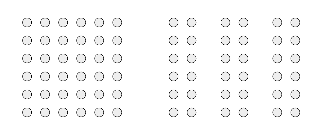
Similaritycopied
Objects which look similar to each other are perceptually grouped. The resemblance can come from shape, colour, shading, or any other consistent visual treatment.
Using similar components tells visitors which items belong to the same category. Conversely, changing one design element — colour, weight, size — on the thing you want to highlight makes it stand out without needing a label.
Continuitycopied
Our eyes tend to follow the smoothest path when viewing lines, regardless of how those lines were actually drawn.
This is a valuable principle if we want to guide users in a certain flow upon using our application.
Closurecopied
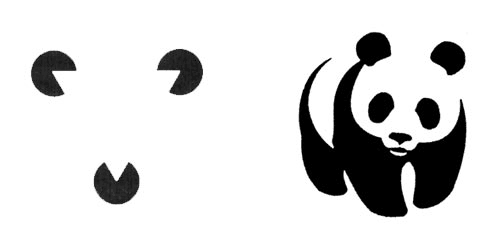
Our brains have a tendency to 'close' the gaps in incomplete objects by using visual perception to complete the figure and see it as a whole.
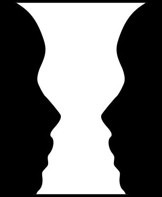
Figure/Groundcopied
Our brain separates a scene into figure (the foreground subject) and ground (the surrounding negative space). This separation is so automatic that we don't notice we're doing it. When that separation fails in a design, everything feels visually noisy.
This principle is often used in optical illusion images such as this:
This principle is useful when designers want to highlight what's currently in use or active. For example, when a search bar is focused, the contrast of the rest of the page drops and fades into ground.
Prägnanzcopied
Prägnanz is a German word for "good figure".
Our brain perceives ambiguous shapes in the simplest manner possible. If a complex set of curves could resolve into a simpler structure, we'll see the simpler structure.
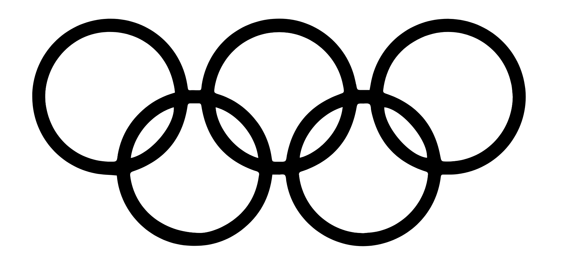
For example, the Olympic logo in monochrome is read as a series of overlapping circles rather than a collection of curved lines.
Symmetrycopied
Symmetrical elements tend to look more orderly, harmonious, and pleasing to the eye. Adding an asymmetrical element to an otherwise balanced design draws attention without needing colour or size to do the work.
Common Fatecopied
Elements moving in the same direction (and at the same optical flow rate) are perceived as more related than elements moving in different directions or not at all.
Consider the following patterns. Which look more harmonious?
>>>>>>>>>>>

>> >> >> >>

>>>> >>> >>

> >>   > >>

>><<>>>><<>
Past Experiencecopied
Visual stimuli are categorised according to past experience. Familiar shapes don't need to be re-explained because the brain already knows them.
For example, we use the floppy disk to associate a button with a saving function. It works in most applications today because the older generation associates the floppy as a medium for files. However, this shared past experience is lost in the newer generation — see Millennials Think The 'Save Icon' In Excel Is A Vending Machine Dispensing A Soda.